Saturday, 12 November 2011

Lecture 6 - Context


Context can change the meaning of something entirely.

For example, Duchamp's urinal in the context of a washroom is a functional purpose manufactured object - a urinal, but taken out of that contact and displayed in a gallery setting is now on object to be considered with different meaning.

Meaning isn't fixed, an extreme example is our current view of a pedophile.
Nowadays people who undertake such acts are viewed as evil - it breaks modern law and is culturally accepted as something that is wrong.
In Greek time however the practice was widely accepted and encouraged.

Hitler performed acts of horrendous magnitude, but in the right context he demonstrates german efficiency and great leadership.

What context is my work displayed in? Online galleries provide noise with many other i mages all around it, my own and other people work, this could create noise or change the meaning of the work.

Art reflects the society in which it is made because the society in which we live provides the context in which the art was created.

Deconstruction.

How a thing can be viewed.

Sexual
Personal
Physiological
theoretical
Historical
Demographics
Environmental
Geographical
Cultural
Economical
Practical
Socio-political
Political
Social
Logical
Aspirational
Inspirational
Technological
Technical

Viewing things in the context of the above gives a framework for comparative analysis, to compare & contrast.

To put this in real terms, the CMOS sensor HarvardInterview that was viewed in Photography could be deconstructed as follows;

It highlights technological advancements, sensors and cameras could be produced smaller, and therefore have wider practical uses, which led to camera being used in mobile phone, webcams, spy pens etc.
The practical advancements resulted in cameras being widely available to more of society, at a cheaper cost.
Environmentally, there are more cameras being produced and therefore more cameras being replaced, and disposed of in land fill.
One off development costs increased as the technology used in  production changed rapidly
Phycologicaly it empowered people to make their own images, but resulted in massive over connection. A god like view of the world in which we were helpless to change events as they unfolded on screen (911 etc) The result is a detached society that isn't easily shocked.
Social effects include the ease in which people invade privacy with people being filmed unknowingly for uTube, up-skirting and facial recognition is employed on sites like facebook. A big brother society where everything is captured for various uses, bot all good ,stalkers etc.
The political uses are that these images can be used to influence people view of the world, news stories showing graphic CCTV i mages of drunken youth beating a passer by - are all youths like this? The possible uses include eye guided bullets personally guided by an image of the intended target.


When making images for my own work, I must consider the message I want to communicate, how it will be decoded and received as well as potential noise. It is equally important to consider the context in which it is displayed and read. The more  tailored the image is to the demographic of the audience, the more easily read it will be, but this includes putting it in the right context. This can include simple things like a title, the i mages around it, the wording that accompanies an exhibition, the likely audience and setting of the work and the possible deconstruction themes employed by both the viewer and myself.

Lecture 5 - Semiotics

Missed lecture - hospital
Notes from other photography students and my own catch up reading

Notes from JM

Lecture 5 - Semiotics 
Semiotics is the study of Signs -
  • Something that stands for something else, made up of two parts
  • Signifier  
  • Signified - what it stands for, referent:
1. Denotative. 
2. Connotative. 
3. Combination (to create a bigger meaning/Message)

Death of the Author - The author is not that important it’s the audience. It’s the effect it has on the audience and what it intended. 
Three different types of signs:
  • Icon - resembles its referent. 
  • Index - Linked to the referent. - Linked but you can’t see it. I.e. smoke and fire. 
  • Symbol - Link to the referent is arbitrary. 
-  Deer linked to woodlands, Triangle says warning. 

I.e. Traffic symbols are symbolic, we decided what they mean. 

Group Examples - 

Traffic Symbol shape is an icon. The colour and writing is symbolic because we decide that. The colour represents danger. 

Index Examples - It is directly linked and a natural link. 
Foot prints are indexical. 
Thunder is indexical of Thunder. 
Pumpkin is indexical for Halloween. 
Cake with Candles represents a birthday
Star bucks cup is indexical for coffee. 

Paradigms - which sign (change the element changes meaning) 
IE - I hate you, I h8 u.  

Syntagms - in what order
Bryan loves Ben
Ben loves Bryan 

Paradigmatic - Choice of elements - Burroughs’s cut ups 
Syntagmatic - Order of elements - exquisite corpse 

"Nothing is a sign, unless it is interpreted as a sign"

Notes from EF

Semiotics

Sign – Signifier                                            1. Donotive               
            Signified – Referent                                    2. Conotive
3. Combination – to create bigger meaning message.

Death of the Author – Roland Barthes  Art (effect) more important to audience.

Icon – Resembles its referent.
Index – linked to referent. E.g. Smoke and fire. See smoke assume fire.
Symbol – linked to referent, is arbitrary.


Icon is the deer as it resembles a deer.
Index is when we think of deer, we think of countryside.
Symbol is the triangle shape, means warning. We have been taught that the triangle sign means warning.

Paradigm – which signs – Replacing one thing to another changes meaning completely.
Syntagm – in what order – I love you
                                                I hate you
                                                I loathe you
                                                Brian loves Ben
                                                Ben loves Brian

“Nothing is a sign, unless it is interpreted as a sign”
  

Lecture 4 - Coding & decoding

Missed lecture - hospital notes from other photography students and my own 'catch up reading'

Notes from JM

Lecture 4
Coding and Decoding  
Semiotics is the study of a signs.  
What is a sign?
In semiotics, a sign is:
"Something that stands for something to someone in some capacity"
It thought of as a discrete unit word meaning including:
Gestures, scents, textures, sounds, images, words, tastes.

I.e. In a shop the smell of bread makes you want to buy bread even if you can't see it. 

CAT - That is not a cat it’s the word that represents the cat. It’s the shapes and symbols of the word or drawing.  
What is a sign?
A sign is made up of two parts, they are: 
Signifier - The actual word, seeing or drawing.  
Signified - Referent, the actual thing i.e. A cat.   

Signified 
  •  Denotative ( what it is ), - Explicit
  • Connotative - Implicit

Connotative
Cat - Fury, whiskers, female (name), eyes, Egyptians, territorial, unpredictable, witches, cruel
Dogs - Loyal, Selfish, Cruel 
Owl - Wisdom, wide, old, evil (Bosh - nock tonal), 

Meanings change over time. Sign are rarely on their own there usually grouped to keep in context. Meaning is fluid. 

Photograph is still a sign. 
Panzani Advert – 
  • Looks Italian but a French brand. 
  • Spaghetti - Italian, the word lux stands for luxury. Colour 
  • Italian and colours are warm
  • The string bag suggests that it’s a sunny place. 
  • Fresh food suggests a fresh healthy life style. The idea of an Italian life style.
  • Big messages but simple advert. The idea fresh food suggests a long healthy life style. 
Donatives what it implies. 

Dior Hypnotic Poison:
  • The fruit could suggest that it has a fruity smell.
  • The color resembles seduction, passion and love.
  • The Garden of Eden is suggested with the apple and the snake.
  • The name is Hypnotic and snakes in films are suggested to be hypnotic i.e. The Jungle book. The snake is very close to the bottle gives the idea of temptation.
  • Indulgence everything you every wanted was in Garden of Eden. 
  • Everything is shiny and new. 
  • The woman in the image is naked looking at us which suggest power. She’s brunette - more sophisticated and darker.
  • Dark back ground.
  • Its an expensive brand.
  • Apple represents poison and the forbidden fruit. The red apple represents danger. 
Overall the advert is a dark sexual image and basically sending the message out wanting something you can’t have. Most adverts nowadays use sex as their way of advertising. 
Advertising is more sophisticated in women’s magazine than men’s. 


Ideal Research:
Roland Barthes - A series of short essays. Images, music, text. 


Lecture 3 - Communication Theory

The Shannon Weaver Mathematical Model (1949) was created for a physical communication through the medium of the telephone, however, it is widely accepted as one of the basic models for any communication.


In terms of the telephone, the source of the message is the person making the call, the message is then coded by the telephone, and transported through the telephone exchange and network to the receiving phone which then decodes the message into the receivers earpiece.
Noise in this sense would be physical noise like like a broken or crackly line which could interrupt or damage the quality of the message, The severity of the noise would dictate wether the initial message was decoded and received correctly.


In terms of visual representation we can use this image as an example;
Diane Arbus, the photographer is the source of the information, it is her ideals and views that are being communicated.
She encodes this by the way she chooses to communicate those ideas; the way she takes the picture, the subject choice.

The channel chosen is a visual channel in the photographic mendium. Displayed in various settings, through books, gallery settings etc.
The receiver receives the image and interprets this to receive the message.

Noise could be anything that could potentially interrupt or damage the communication of Arbus's message.
In this case, time, the political and social setting of the viewer
Their own beliefs & views of society
The channel could also provide noise - Ina gallery how much other visual image is displayed around the piece which could influence the viewers reading of the image.


I have found these other models which apply equally as well.

 Feedback ensure the right message is being received by the destination receiver - in terms of modern culture this could be focus groups, feedback questionnaires and panels.


This model is more in-depth and adapts the basic model to fit more than technological literal messages  - and explains further where noise could affect the integrity of the message.

In considering this model in my own work, I must be aware of the potential noise that may distract, either within the image or within the setting that the image is shown. That the things around us influence how we interpret visual messages, and that people own experiences, attitudes and beliefs will also have an impact on how they view the world.

In you take noise in a literal sense, the way we would overcome it in language, is to shout, and the same applies with visual communication. A large volume of images communicating the same thing can fight the noise around them, using the same message over and over is a method more easily seen in advertising, and is known as redundant messaging.

Some examples of this are;
We buy any car .com adverts on radio & TV, the name of the company really says everything they do, yet songs and jingles are used to repeat the phrase over and over again, if the reciever did dot successfully decode the message the first, third or forth time in the first ad, the third or fourth reception of the advert will ensure that the desired message has been received 'loud and clear'

Domestos bleach uses the same method. The products kill germs dead! Two words that are not required in combination to relay the message, if something is killed, it is dead. This is reinforced by the slamming down of the bottle, and backed up by images of the liquid in action and computer generated 'evil' germs being killed.


The opposite of redundant messaging is entropic - easily seen in art, but still something employed throughout visual media, is Entropic.
Entropic messaging works to convey complex issues, there may be multiple symbols/signs within one image, each one communicating a different message or view. With entropic imaging there is a chance that the original message with not be correctly decoded by the receiver.

Photography -  Tim Hetherington example

Photographer - Source of information or message

He encodes by choosing the way he takes the images, the lighting/framing/tones all come in to play in the way he chooses to share and depict the message

Chanel - the medium of display (the image itself, the book if it were published, the gallery walls that display it, the camera)

Viewer - receives and interprets the message based on their own understanding, background & education.

Noise in this case could be:
  • the environment in which the image is displayed (the internet is overcrowded with image & information and gallery walls display other works in close proximity)
  • Other people, giving their views on the image
Volume fights noise, so these images could have been displayed on a huge scale, or been shocking, or repetitive in order to combat any noise.

Redundant Messaging
In this model, the viewer is subjected to the same message over and over.
domestos Bleach is a good example - Kills all known Germs Dead is not proper english, nor is it the way we speak. If something is killed it 'is' dead, yet the wording reinforces itself. The bottle is slammed down in a show of strength. The product seen in use with graphic 'evil' armies of 'germs' dying on contact.

In redundant messaging, there can often be actual 'shouting' to make sure the viewer is listening.

Feedback
How does one know if the right message has got through?
In the case of TV and advertising, feedback, forums and focus groups are one way as well as purchase/viewing figures.
Producers are quick to act if the medium is not having producing the desired outcome.


Lecture 2 - Graphic Design is the New Fine Art?

In this lecture we had an open lengthy discussion about the above Rick Poyner quote.

Graphic Design;
Manufactured for a purpose or specific message with a set process dictates its production.
Linked to industry and therefore linked to the consumer culture.
This then dictates that it has to have mass market appeal for profitability of client

At is basic fundamental level, graphic design arranges layout, text, typeface and image using multiple mediums

Fine Art;
An expression of personality, point of view
Elitist through gallery culture & price
Aesthetic
More contextual


Creative, primarily for imaginative, aesthetic or intelectual content.


There is no right answer, whilst they are two different disciplines, the role of each now has so much overlap. Graphically designed images that where originally intended as product driven workflows can now be seen as posters or framed images, being used as decorative art. And as a population we may now more readily accept graphic design as it is more assecible. We may see Fine art as more traditional or elitist, yet Monet's images are readily available a covers to address book or on transfers in china mugs.

Here are examples of the vast cross over between the two areas.

The creative layout of a magazine using photography

Graphic design in posters (wall art)

Digital Art


Digitally altered photographic images

Graphic design to decorate the home

Iconic art used in commercial products

Monet to decorate a bag

Text as wall art


Lecture 1 cont - The Role of Art & Design

Art & Design is a complex subject, designers take a great amount of time to consider how something should look and the impact that will have on the end user.

We design things for;
Aesthetically pleasing qualities
We want things to look nice around us, its main purpose is decorative

Impact & Influence (Advertising)
Advertising, media, press, politics, peer pressure - all these things want to influence the way we perceive something and then change the way we feel about them.

Communication
To visually communicate a message of some description.


Evokes emotion
For a cause, a political campaign, a point of view


Identification (values/standards)
Creates and provides a feeling of belonging

Manufactured (Counter culture)

Consumer/Capitalist Culture

Need v's Want/Desire
An example of this would be the Mac 'i' products, there are hundreds of different models of MP3 player available on the market, often cheaper than the Apple version, however because of its design and popularity, people perceive this product as the best one to have and to own. An item that is not essential to living (it plays music) but is on everyones list of something they need to own.

In my own study I have been looking at how images are used in  different ways in advertising and in publications through commercial and editorial photography.
In these examples they want to appeal to a target audience to influence their opinion or buying habits, by taping into the above.
By better knowing the target audience (demographics) the better they can communicate the message they have to deliver and in a marketing environment, drive the consumer culture.
As each image will have multiple readings and purposes, it is an indication of why art & design; and communication theory is a complex issue.


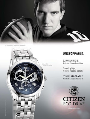
Advert for a watch. Linking the quality of the watch to the 'unstoppable' characteristics of a famous american footballer. The image links the two and uses celebrity endorsement to influence the viewers opinion of the product. The word "Unstopable' is used repetitively to re-inforce the message that is communicated. The ad also makes use of brand logo's which themselves will already have an identity that appeals to a certain demographic. It is a product which is manufactured and made, and the sale of items will drive the profitability of the company.
The way the image is lit and pictured, shows a product of good build quality, with the light 'flare' illustrating the message that the watch runs from sunlight and does not need a battery.


In this campaign for a children's charity, the images are the main focus of the full page, with little text, so this has to communicate as much as is possible to the viewer.
The image is set in a neutral home environment, so that anyone could relate to the setting; it is not something that indicates a class or a social standing.
The children dresses in light neutral and white colours, blonde hair eye are almost the epitome of angelic perfect infants; again to appeal to the viewer and communicate their innocence.
The children are then altered with digital manipulation, looking like fragile broken china dolls, literally broken with their smashed remnants littering the clean surroundings.
The strap line, which again is subtle reinforces the message "You can loose more than your patience"
This campaign is both moving and shocking, that you, the individual reader, could in a fleeting moment of temper, be responsible for 'breaking' an innocent, fragile child.

Lecture 1

This years lectures will look at how we interpret visual media.

Recommended reading -
Practices of looking
Visual communication theory

Topics covered -
Communication Theory
Semiotics
Art & the mind
News & Values
Representation
Effects Theory
Importance of Context
Influences
Academic writing
What does that mean?
Film Theory
Themed Lectures;
Death, Love, Beauty, Sex, Evil, God

The purpose of this blog is to summarise the lectures, but also link it into my own practice and photography generally.

Where ever possible I will make links or reference to my own work which is hosted on another blog or Flickr.